The below works are taken from my 2022 Master's thesis, Humanizing Computational Literature Analysis Through Art-Based Visualizations in which I completed a computational analysis of 15,000 fictional works taken from Project Gutenberg. The analysis was aimed at identifying how and how often males versus females are characterized. In an effort to humanize the results of what sometimes feel like a cold, analytical method of analysis, I chose to translate the findings into an art portfolio that includes computational art as well as pure studio art pieces. Not only do the works intend to bring the viewer closer to such impactful findings, but art-making process served as a therapeutic venture that allowed for me to fully unpack and understand the implications of the computational literary analysis.
Shift
The Shift visualizations were named for there abilitiy to show the shifting of gender representation throughout a single book. They were created by dividing a book into three equal parts, meant to symbolically represent the three parts of the classical story arc. Sentences within each respective third that contained one or more of a predetermined gender-specific word were tagged as either female, male or both. In each row of the diagram 1,000 dots were generated. The percentage of gendered sentences that were labelled female determined the number of dots that were placed in the right rectangle. Conversely, the percentage of male sentences dictated the number of dots on the left.
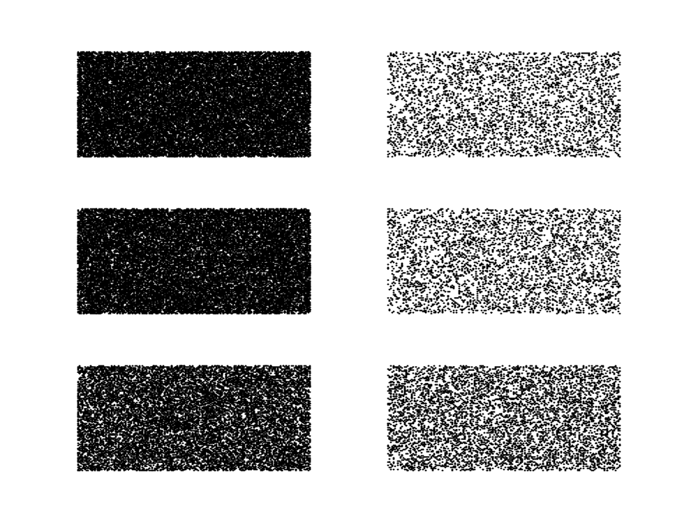
A Tale of Two Cities
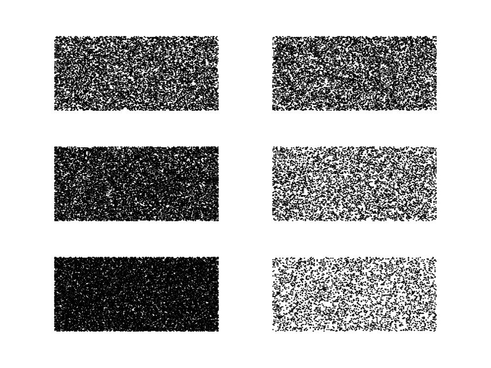
The Great Gatsby
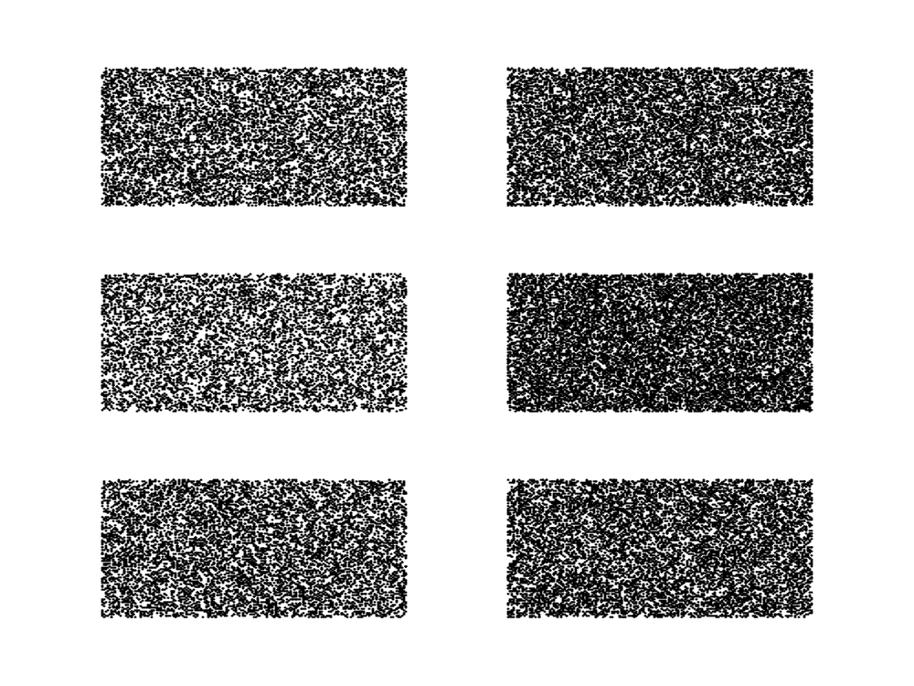
Pride and Prejudice
.png)
Moby Dick
X Visualizations
While the Shift diagrams were successful in visualizing the gender representation in a single work, they lack the ability to convey this information for several books at the same time. The X visualizations were reimagined to fill this gap. Each X consists of a line beginning at the lower left and ending at the upper right representing the female representation and a line beginning at the upper right and ending at the lower left representing the male representation in a single work. The segments are each divided into thirds which, moving from the left to right, represent the beginning, middle and end of the fictional piece. The width of the individual thirds of each segment are proportional to the percentage of total gendered sentences that are labelled with the respective gender within the corresponding division of the book. The X diagram below visualizes the hundred most downloaded ebooks from Project Gutenberg in the week of October 3, 2022.
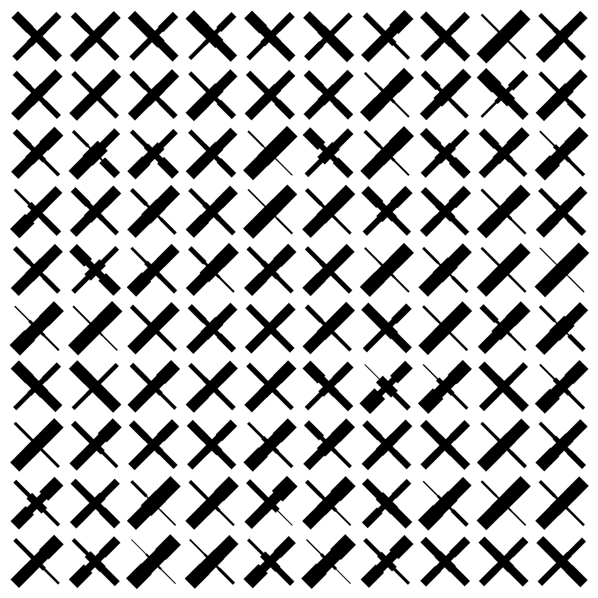
100 most downloaded ebooks from Project Gutenberg
Pen Plotter Art
The following were created using an AxiDraw V3 pen plotter. While this type of machine is most commonly used with a pen or pencil, we found that the output was most interesting when we used it to create acrylic paintings. The individual pieces in Adobe Illustrator layer by layer. Each layer began with a line in the space to the right of the drawing surface. This line was designed to drag the paintbrush through the paint palette (which would be placed to the right of the drawing surface) thus loading the paintbrush with sufficient paint to execute the following lines within that layer.
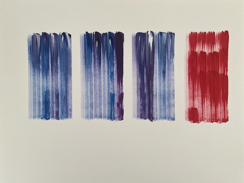
This piece was created in reaction to a trend found in the analysis of the complete set of 15,000 fictional works: the amount of female representation rapidly decreased in books with author birth dates between 1850 and 1930. The color blocks represent each of the fifty year blocks of time that author birth years fell within in the data set. Moving from left to right, the first column represents the first fifty year block of author birth years in the data set, ranging from 1750 to 1800. The rightmost column represents data from books with author birth years from 1900 to 1950. We anticipated the resulting data from analyzing books with author birth years from 1750-1900; there was greater male representation than female. Blue and purple were selected for the first three columns of blocks to represent our unsurprised, though unhappy, reaction when the frequency data for the corresponding spans of time matched our assumptions. The red color block representing 1900 to 1950 is meant to be abrupt and striking, reflecting our puzzlement when female representation in the dat aset abruptly dropped off.
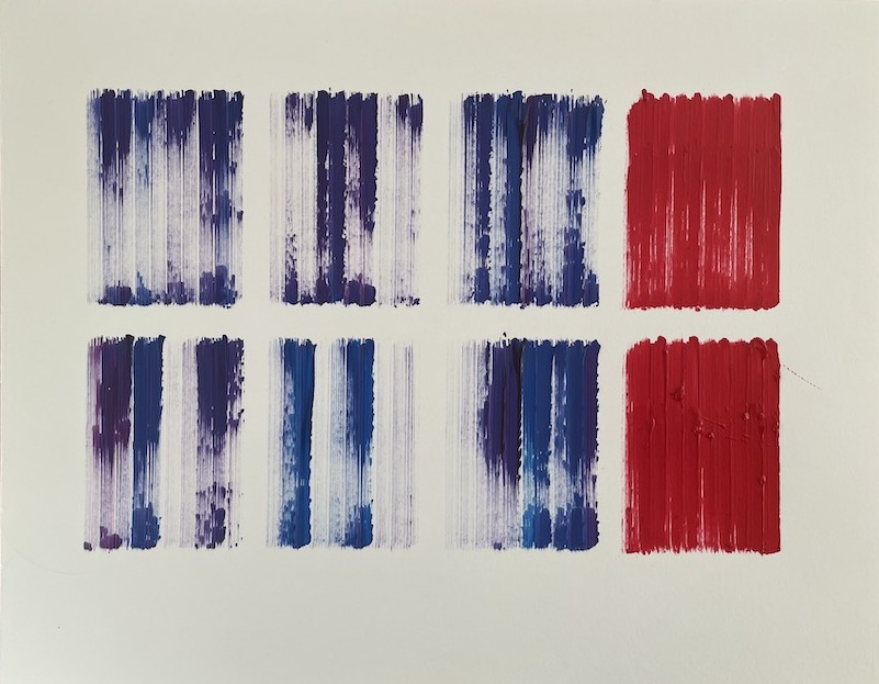
The acrylic painting pictured here extends ideas from the previously discussed painting by augmenting with reactions from the sentiment analysis of the fictional works. Like the previously described piece,the four columns represent the fifty year blocks of time. In this rendition, however, the top row illustrates findings from the frequency analysis while the bottom row represents results from the sentiment analysis. Once again, blue and purple were selected to reflect the first three half-centuries because the results were relatively unsurprising. Red was selected to represent the sudden drop in positive sentiment surrounding both male and female characters and, perhaps more surprisingly, the fact that the drop in positive sentiment was greater for female characters than male. We ask the viewer to consider these trends more deeply. Is there a causal relationship between the drop in positive sentiment and lack of female representation? What was happening in the world that may have contributed to the shift in literature?
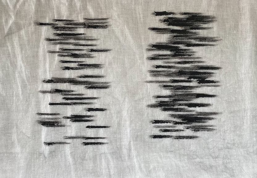
Created on linen, the painting above is also a piece of work designed with p5.js and executed by the AxiDraw pen plotter with black paint. Instead of focusing on a trend over time, this piece depicts the number of female versus male sentences in the entire data set. A total of 100 lines were randomly generated in the complete piece. The number of lines that appear on the right side versus the left side represent the ratio of female to male sentences throughout the data set. Once again, we rely on the lack of balance in the piece to encourage viewers to digest the large disparity in gender representation.